WTA Website Redesign
A working rebuild of the WTA tour site — live scores, players, draws and rankings — shown the way I'd design it today rather than as it looked in 2016.
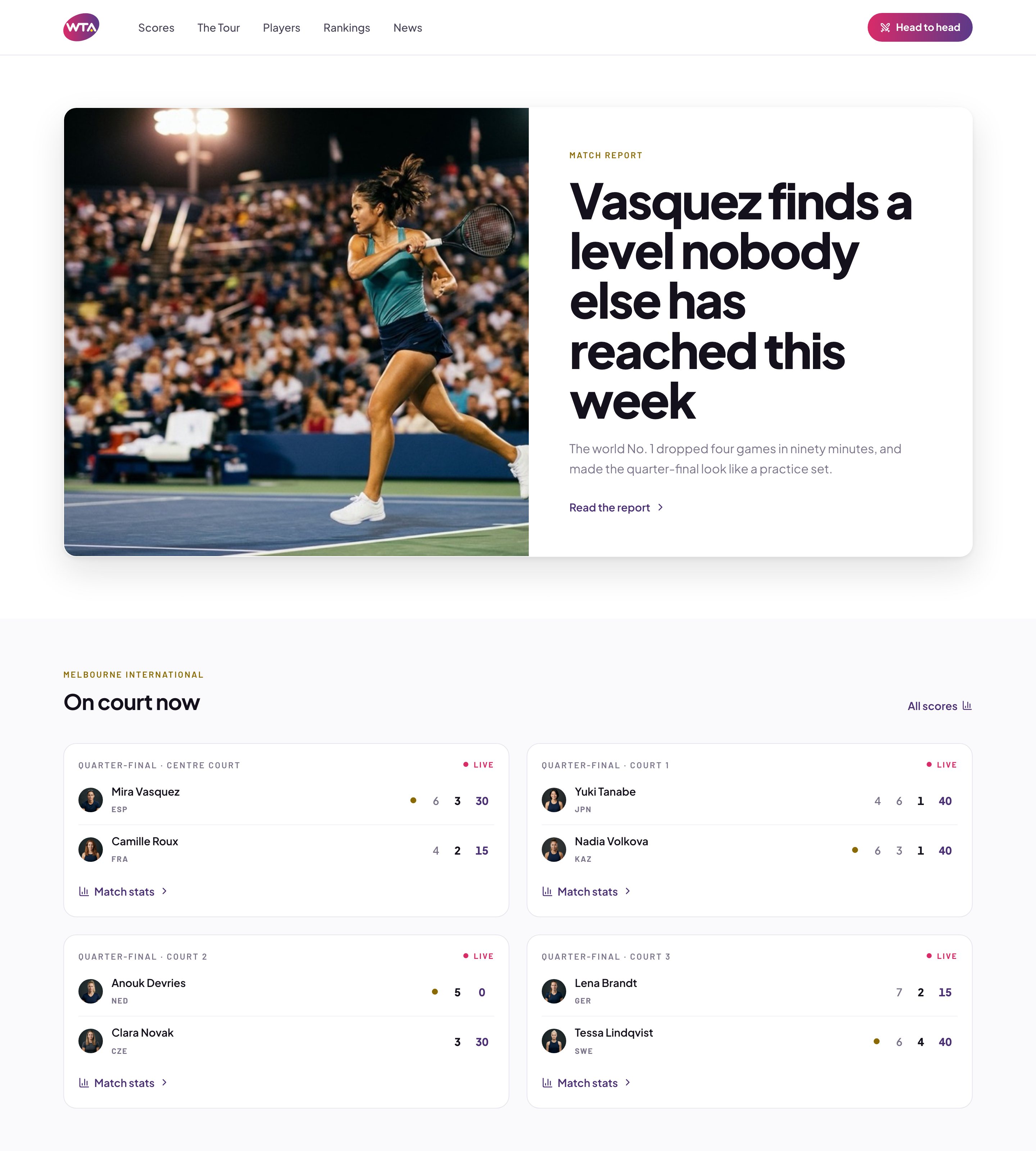
Data density meets editorial design
A tour site has to serve a fan checking a score between points, a journalist after match stats, and someone who came for a player profile or a highlight — three reading speeds in one interface. Get the balance wrong and the live data drowns the editorial, or the editorial buries the scores.
I answered that in 2016 with the tools of 2016: fixed grids, small type, and a stack of modules competing for the top of the page. The structure held up. The execution dates. Both are below — first the screens as they shipped, then the same brief answered again with what a browser can do now.
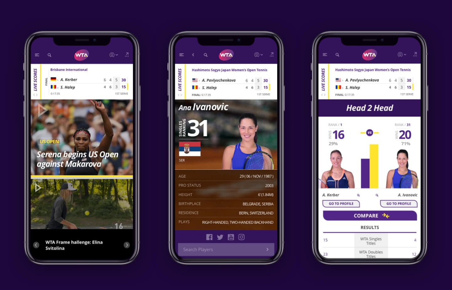
The original design
Live scores pinned above a full-bleed match report, and the same hierarchy folded down to a phone. Everything on this page below here is a present-day rebuild; these two are the work as it launched.

How I'd design it today
Same problem, re-solved with what a browser can do now. It is a working prototype rather than a screen set — drawn from a design system, so it stays crisp at any size. It is a concept: the players, tournaments and results in it are invented.
- 01
Scores that actually tick
One match model feeds the home page, the score board and the draw, so a point won ticks through all three at once. Scores are the spine of a tour site; treating them as a widget is what makes everything around them feel stale.
- 02
Five entries, one hierarchy
Scores, The Tour, Players, Rankings, News. Everything else is reached from a screen you are already on — a draw from a tournament, a profile from a scoreline — so the nav never grows to cover the whole site.
- 03
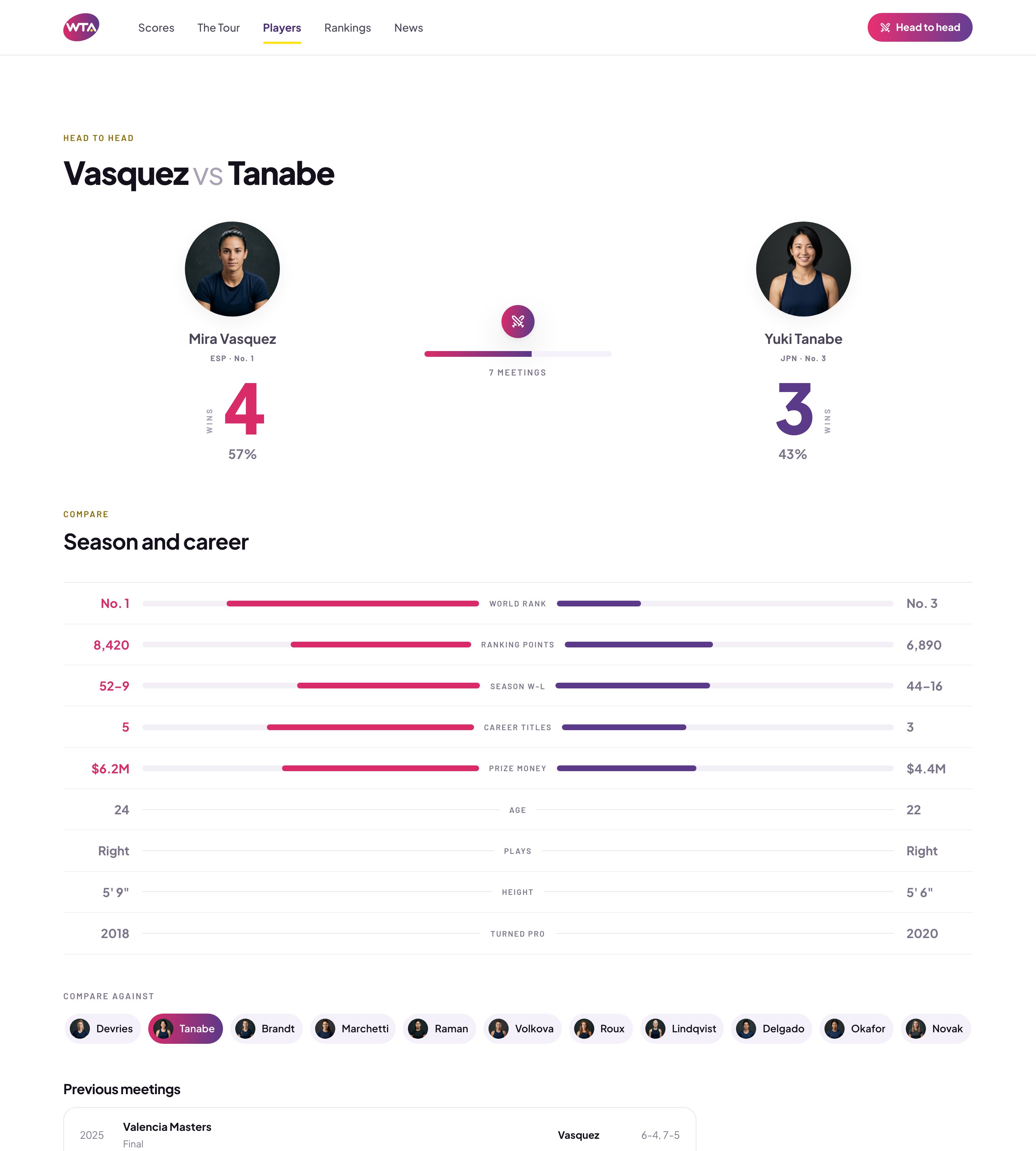
Head to head as a center column
Two players either side, the metric named down the middle, bars measured out from it. Comparison is the one thing a stats table is bad at, so it gets its own layout instead of another row of numbers.
- 04
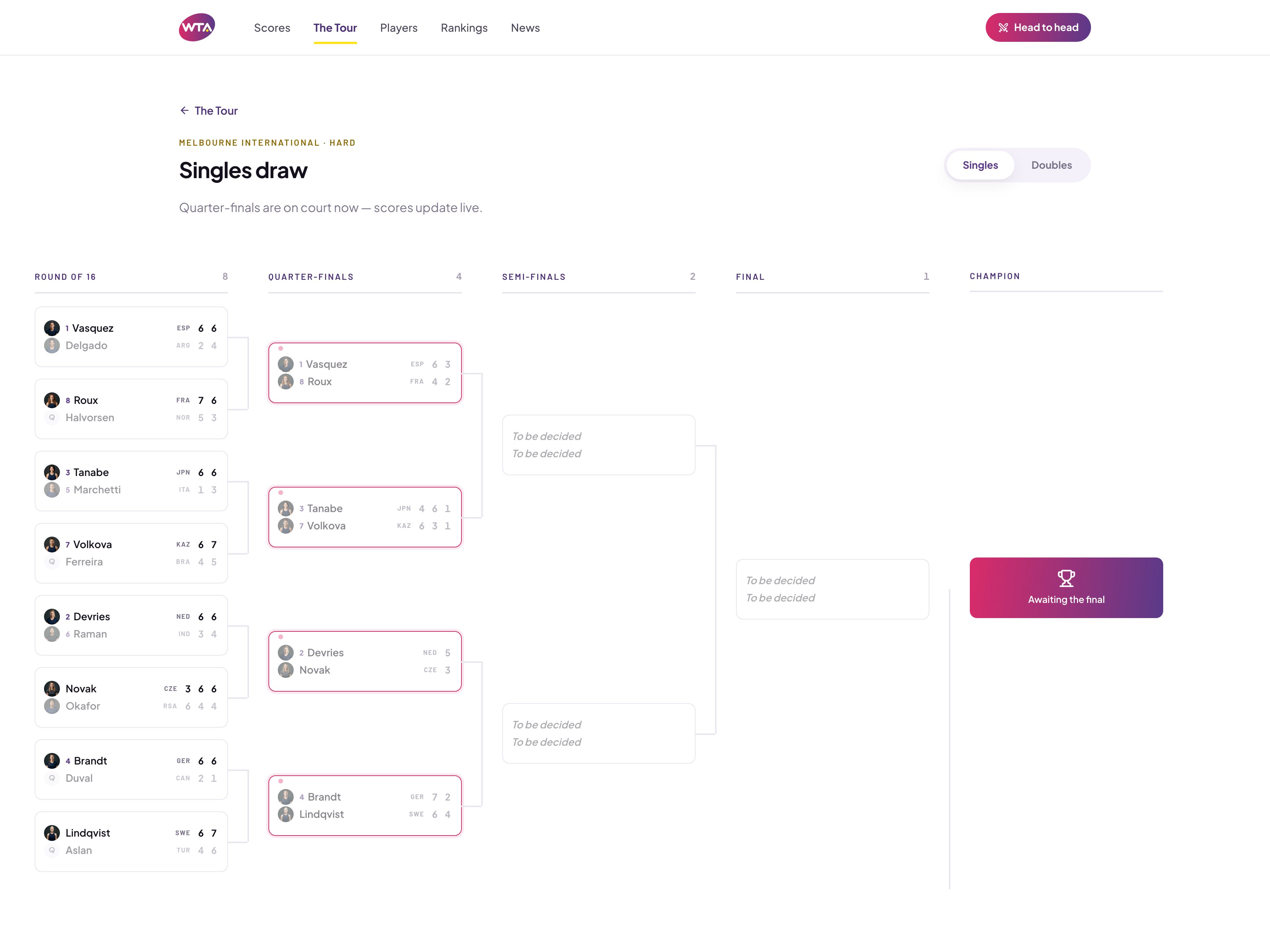
A draw that keeps its shape
Rounds as columns, live matches outlined, undecided slots left visibly empty rather than hidden. On a phone the bracket scrolls sideways instead of collapsing into a list that stops being a draw.
- 05
Type carries the density
A display face at real size for headlines, tabular figures for anything numeric, and enough air around a scoreline to read it at a glance. Most of what dates a sports site is type set too small and packed too tight.
- 06
One layout at every width
Score cards, brackets and stat tables reflow rather than get cut down. The phone keeps live data at the top and folds the rest away, so nothing has to be designed a second time.
Two screens that make the case
Head to head
The comparison sits on a shared center line: portraits and win share at the top, then every metric measured out from the middle so the gap is the thing you read. Picking a different opponent from the row of pills re-runs the whole page.
The singles draw
Every round is a column, live quarter-finals are outlined, and the slots nobody has reached yet stay empty instead of being hidden. The draw and the score board read from the same tournament, so a live result moves the bracket while you are looking at it.
Explore the rebuilt prototype
A clickable rebuild of the WTA tour site, drawn from the design system rather than from screenshots so it stays crisp at any size. Live scores tick through real tennis scoring, the draw and the score board share one tournament, and every screen is real markup — players, tournaments and results are invented.